Shape How The World Reads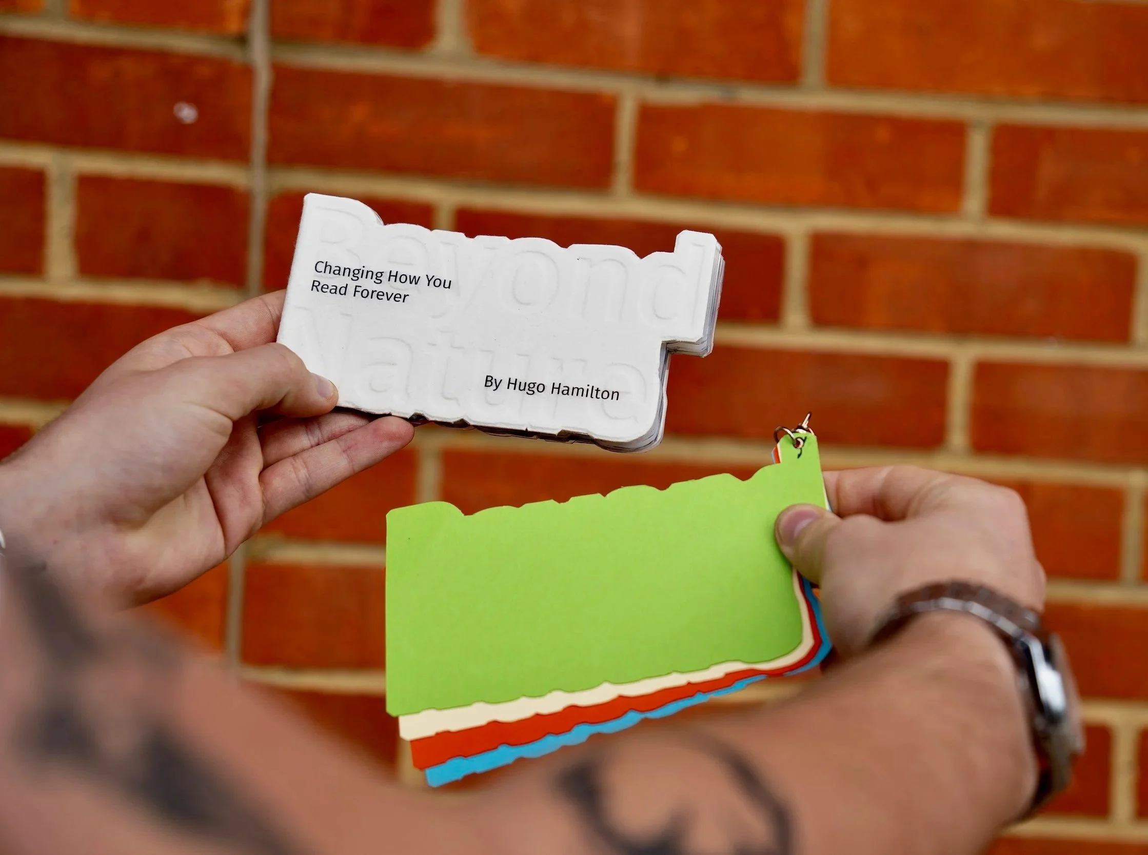
This project was been a valuable exploration of both accessible design and my own creative process, particularly in how I approach research, experimentation, and refinement. Looking back, I feel very positive about the outcome and the direction I took, especially in grounding the project around a clear user persona. Designing for Alex Carter helped me stay focused on real needs rather than abstract ideas, and it pushed me to think more carefully about how typography and layout impact readability for people with dyslexia.
09/04/2026
University of the Creative Arts
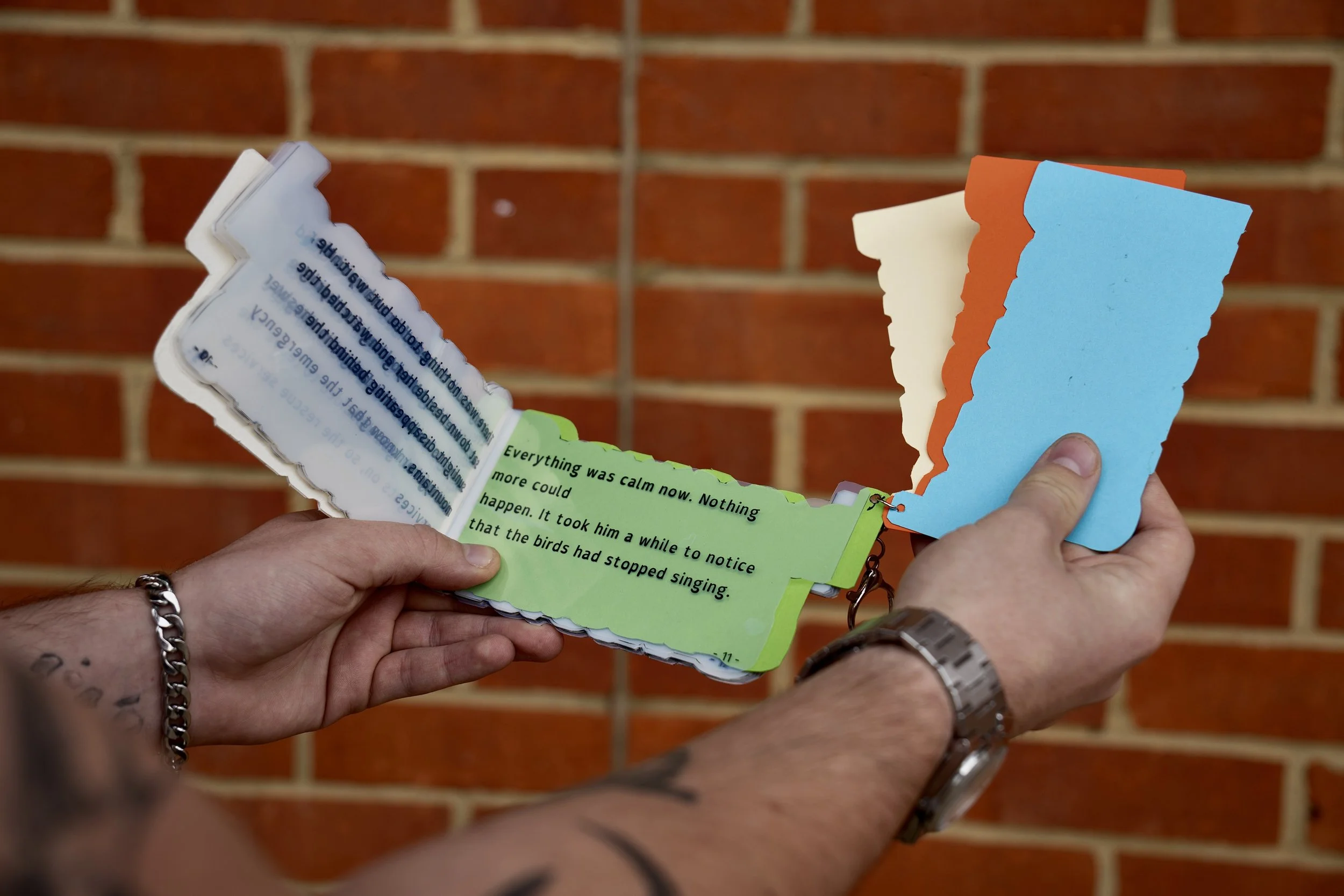
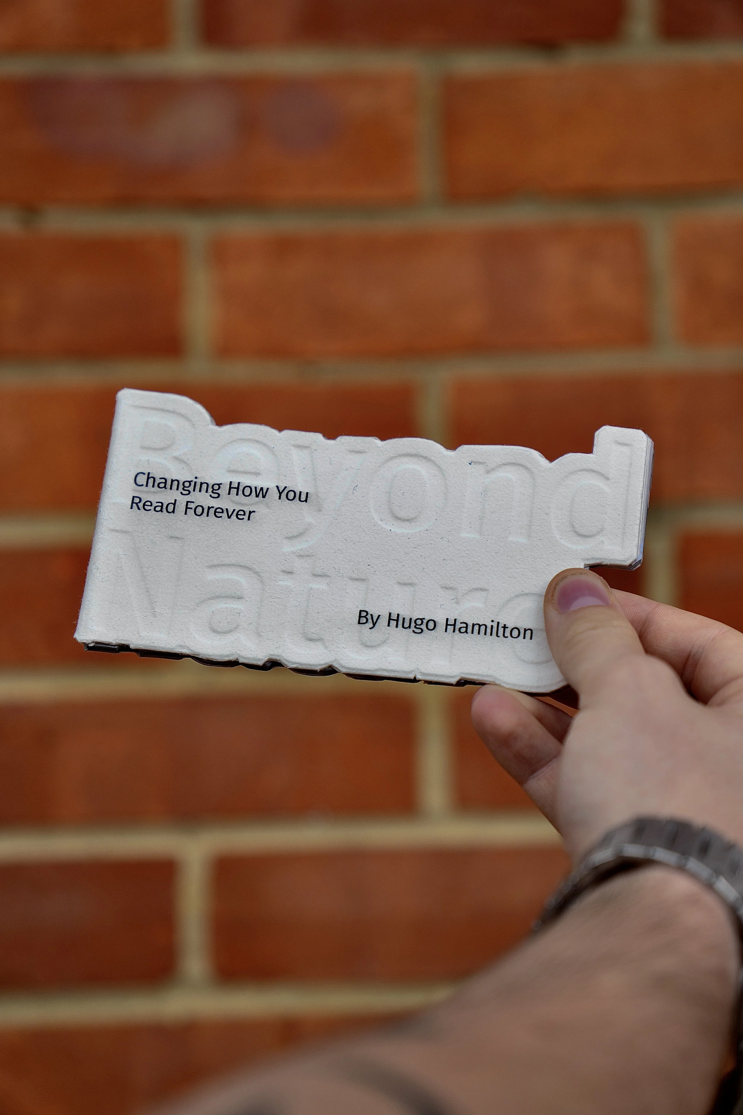
One of the most important things I’ve taken from this project is that dyslexic-friendly design is not just about creating a specific typeface, but about a combination of thoughtful decisions. My research into dyslexic typography showed me the importance of spacing, hierarchy, and clarity, which I then applied throughout my designs.
Photography credit: Mikey Haig