Shape How The World Reads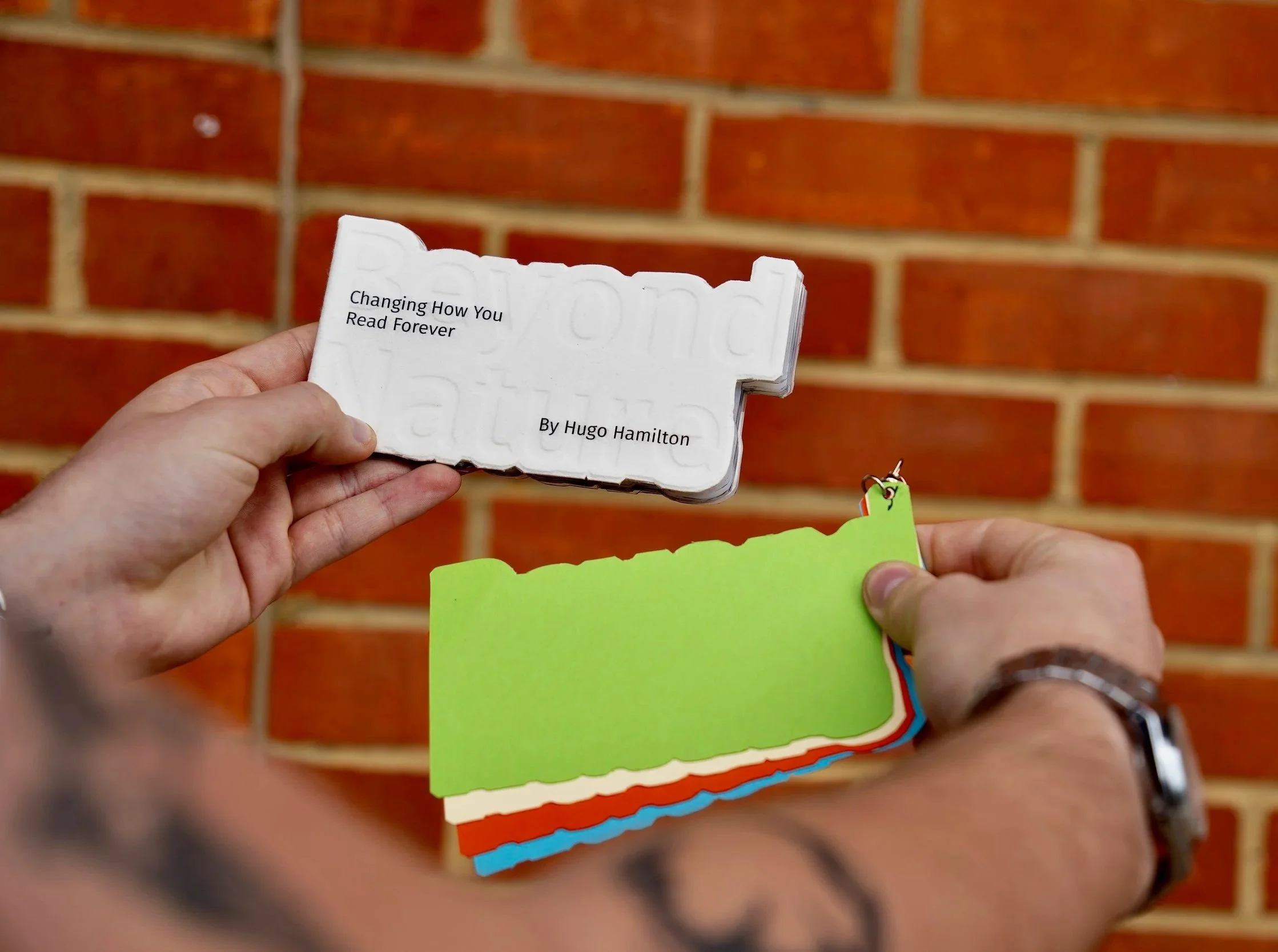
This project was been a valuable exploration of both accessible design and my own creative process, particularly in how I approach research, experimentation, and refinement. Looking back, I feel very positive about the outcome and the direction I took, especially in grounding the project around a clear user persona.
Designing for Alex Carter helped me stay focused on real needs rather than abstract ideas, and it pushed me to think more carefully about how typography and layout impact readability for people with dyslexia.
“Shape How The World Reads” explores how typography and editorial design can improve readability and accessibility for people with dyslexia. The project began as an investigation into how visual communication can unintentionally exclude readers, particularly within educational and informational contexts where clarity is essential.
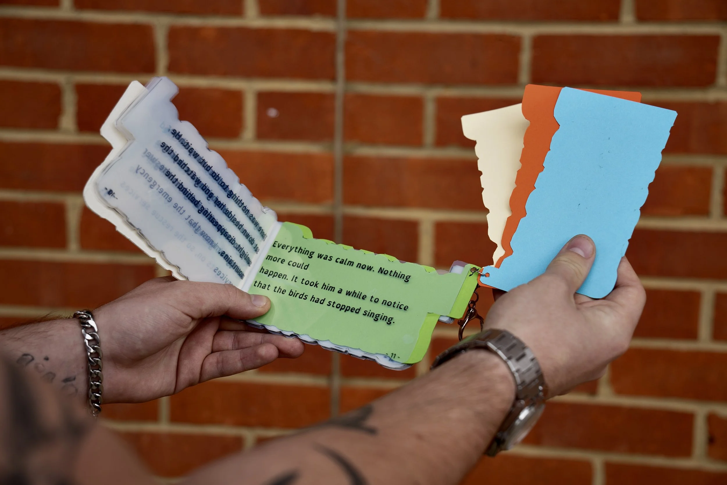
Through research, experimentation, and iterative design development, I explored how type choice, spacing, hierarchy, rhythm, and layout can work together to reduce visual stress and improve reading flow. Rather than designing purely for aesthetics, this project challenged me to consider how graphic design can actively support user comfort, comprehension, and confidence.
The final outcome combines accessible typographic principles with a visually engaging editorial approach, aiming to demonstrate that inclusive design does not need to compromise creativity.
09/04/2026
University of the Creative Arts
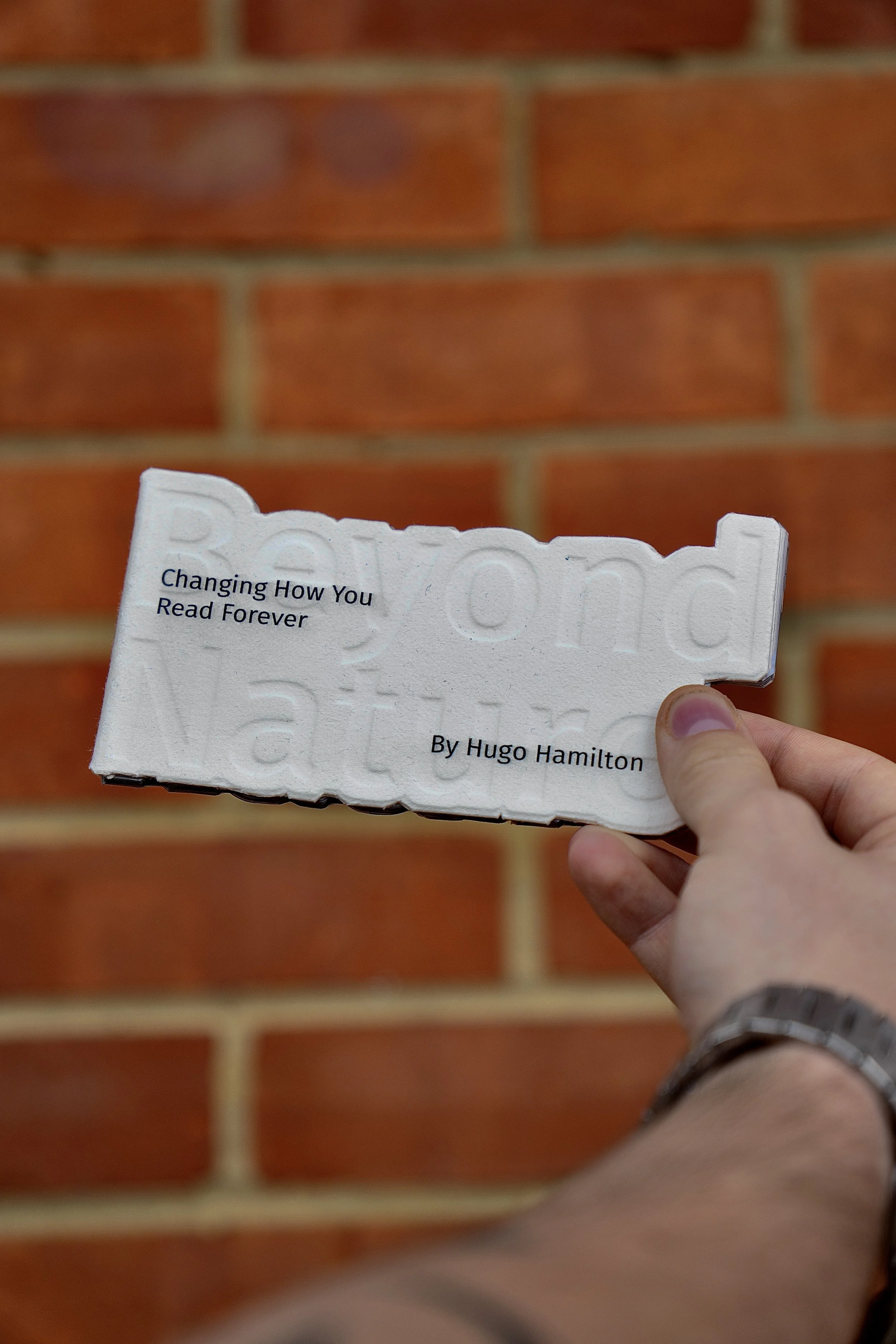
One of the most important things I’ve taken from this project is that dyslexic-friendly design is not just about creating a specific typeface, but about a combination of thoughtful decisions. My research into dyslexic typography showed me the importance of spacing, hierarchy, and clarity, which I then applied throughout my designs.
This project significantly changed the way I think about graphic design and communication. It reinforced the idea that accessibility should not be treated as an afterthought or optional consideration, but as an integral part of the design process from the beginning.
One of the most valuable lessons I learned was that accessibility often comes from a series of subtle, intentional decisions rather than one singular solution. Typography, spacing, hierarchy, pacing, and composition all contribute to the reader’s overall experience.
The project also strengthened my confidence in research-led design and showed me how critical experimentation and iteration are when solving real communication problems.
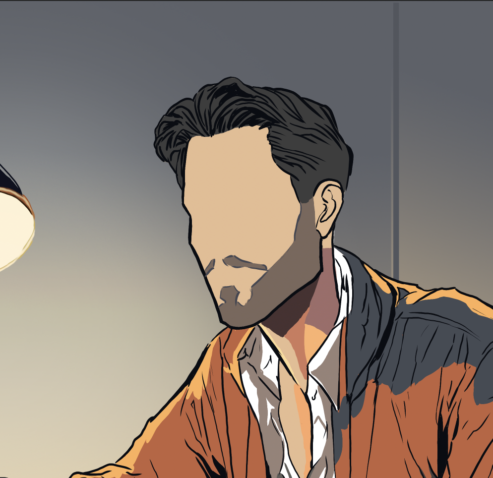
Creating the user persona of Alex Carter helped ground the project in a realistic context rather than approaching accessibility as a purely theoretical exercise. By designing for a specific individual, I was able to make more intentional decisions throughout the process.
Alex represented a reader who is intelligent and engaged but often experiences frustration when confronted with dense layouts, inconsistent hierarchy, or difficult-to-read typography. Referencing this persona throughout the project helped me continually evaluate whether my design choices were genuinely improving accessibility.
This approach also reinforced the importance of empathy within the design process. Instead of asking “Does this look good?”, I began asking “Does this communicate clearly and comfortably?
The final outcome presents a typographic and editorial system designed to support readability while maintaining a strong visual identity. The project demonstrates how accessibility-focused design can still feel expressive, contemporary, and visually engaging.
By combining research-driven decisions with iterative experimentation, the final designs aim to create a more inclusive reading experience that reduces visual strain and encourages engagement with written content.
Ultimately, “Shape How The World Reads” became not only a typography project, but an exploration into the responsibility designers have when shaping how people access information.
Photography credit: Mikey Haig